Case study
Rise Psychotherapy
The practice wrote its own copy. The work here was finding a shape for it - one calm, legible page that somebody having a hard week can actually get through.
- Sector
- Clinical practice
- Location
- Canton, NY
- Year
- 2026
- Copy
- Written by the practice
- Live site
- risepsychotherapysolutions.org →
The problem
Somebody looking for a therapist is usually having a hard week. A site that makes them hunt for fees, insurance, or how to book adds friction at exactly the wrong moment. This practice arrived with its words already written - the approaches, the clinical language, the fee policy, all in its own voice. The question was never what to say. It was how to lay it out so a person in that state keeps reading instead of leaving, and how to handle first contact without the site ever touching sensitive health information.
The approach
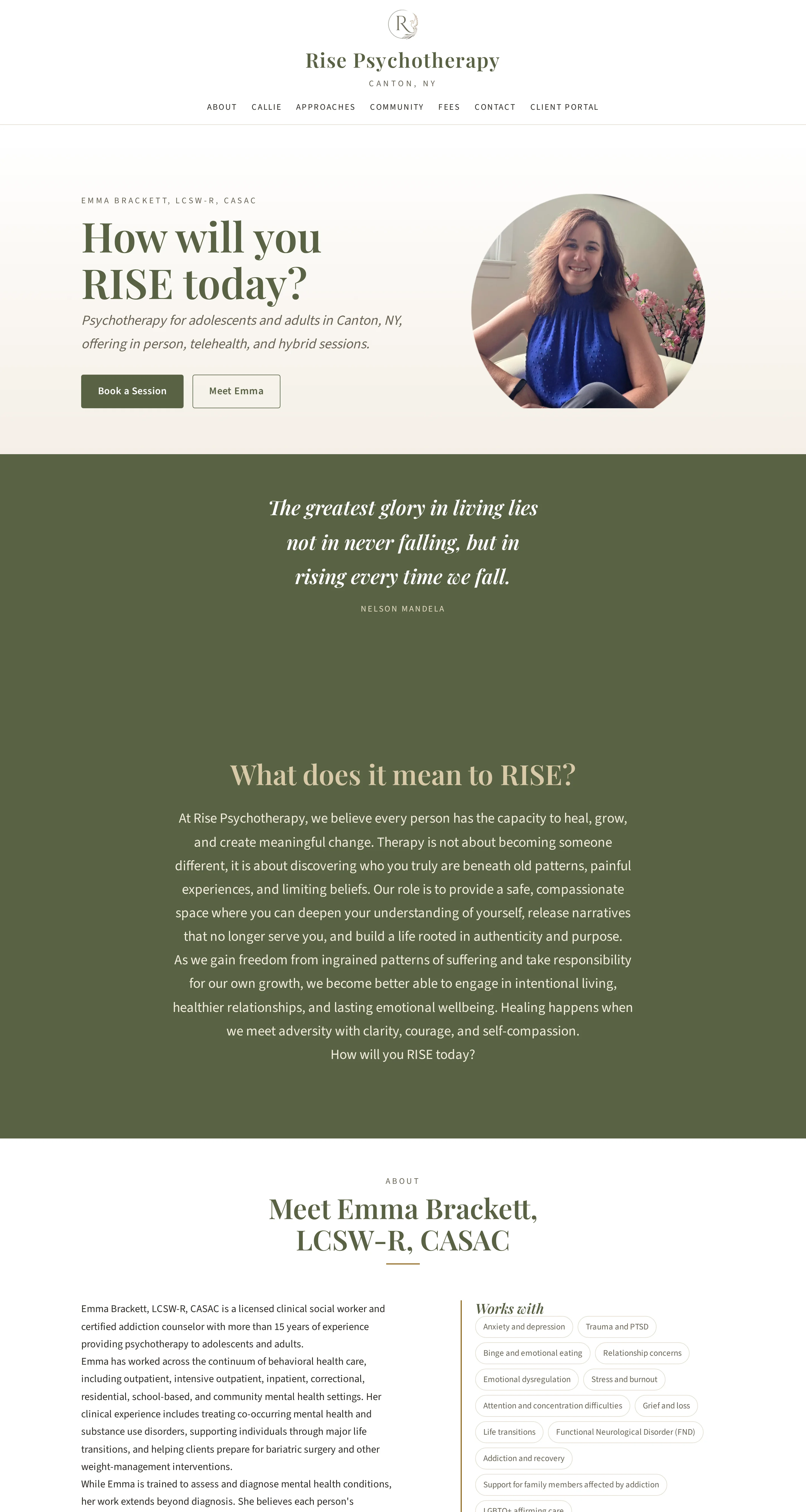
The words are the practice's; the structure is mine. A single quiet page, sequenced by the questions a prospective client actually arrives with - who you are, what you treat, how you work, what it costs, how to start - with anchored navigation so nothing is more than one click away and booking is reachable from any point on the scroll.
What was built
- Long-form single-page layout with anchored navigation, so nothing is more than one click away
- A dedicated, individually linkable section for each of the four therapeutic approaches, in the practice's own wording
- Fees and out-of-network insurance given their own section rather than left for a phone call, at the practice's request
- Client portal integration for booking and billing
- Contact form with spam protection, routed to email and a private inbox, and carrying no health information
- Newsletter for community offerings, training, and retreats
- Typography, spacing, and color chosen for sustained reading, not for decoration


What makes it work
Details that mattered here
Their words, my structure
Every line of copy came from the practice. What got designed here is the order it appears in, how fast it reads, and how few steps sit between a question and its answer.
Accessible by construction
Color contrast, focus indicators, heading order, and reduced-motion support are checked automatically on every change.
Fees where they get found
The practice chose to publish its rates and out-of-network reimbursement openly. The layout puts them where people actually look, which removes the most common reason a first email never gets sent.
Warm without being soft
An olive and cream palette with a serif display face reads as a professional practice, not a wellness brand.
What they run without me
Everything below is edited by the client, in a browser, whenever they like. Each of those edits goes through the same checks as any change I make myself.
- Every word on the page - the practice writes and edits its own copy
- Fees and out-of-network insurance details
- The four therapeutic approach sections
- Newsletter items for community offerings, training, and retreats
- Photographs
Where it landed
A prospective client can go from landing on the page to booking a session without ever leaving it. The practice owns the site, the domain, and the words on it, and can change any of the three without me.